What is User Interface (UI)?
User Interface (UI) is the visual, interactive, and behavioral layer through which people execute their intent on a website or app, layouts, buttons, menus, typography, forms, icons, and feedback states. In semantic SEO terms, UI is not decoration; it is the delivery mechanism that determines whether your content is consumed, your internal links are used, and your information architecture becomes a meaningful network rather than a pile of pages.
Modern SEO increasingly rewards experiences that reduce friction, strengthen satisfaction signals, and make content discoverable in both human and crawler pathways. This is why UI now sits inside holistic optimization, connected to On-Page SEO and Technical SEO at the same time.
Why UI is an SEO Topic Now (Not Just a Design Topic)?
UI becomes an SEO topic the moment it affects behavioral outcomes and crawlable structure. Your interface shapes how users move across pages, whether they understand your content hierarchy, and whether they trust the page enough to continue their journey.
When UI is weak, you usually see:
Less interaction with an Internal Link structure (users don’t explore).
More pogo behavior and reduced Dwell Time (users return to the SERP fast).
Higher abandonment at key actions (form friction, unclear buttons, confusing flows).
In other words: UI doesn’t “rank” by itself, but it directly influences the outcomes search engines can observe and infer, especially through engagement and task completion.
User Interface vs User Experience: Clarifying the Relationship
UI and UX are not competitors, they’re layers of the same system. UX is the journey logic and satisfaction outcome; UI is the surface execution of that logic through controls, visual hierarchy, and interaction patterns.
A strong UX strategy still fails if the UI introduces friction:
The content is good, but scanning is hard because the hierarchy is weak.
Navigation exists, but the UI hides it, making discovery painful.
The page answers the query, but buttons and forms create confusion.
From a semantic architecture view, UX is the “why” and UI is the “how.” And that “how” determines whether your topical structure behaves like a connected knowledge system, similar to how an Entity Graph maps relationships between concepts and pages into navigable meaning.
UI Through a Semantic SEO Lens: Interface as a Meaning Delivery System
In semantic SEO, we don’t treat pages as isolated documents, we treat them as nodes in a network. The UI is what makes that network usable. If your interface can’t guide users through the right steps, your “network” becomes invisible.
This is where concepts like:
Contextual Flow (smooth idea progression),
Contextual Borders (staying scoped to intent),
and Contextual Bridges (intent-preserving transitions)
become UI decisions, not just writing decisions. Your design should visually enforce topical scope and guide users into adjacent subtopics without breaking meaning.
Practical implications:
UI spacing, headings, and sectioning decide whether users “feel” the borders.
In-content CTAs and related modules act as contextual bridges.
Sticky nav, breadcrumbs, and “next steps” create controlled movement across the cluster.
Core Components of UI That Directly Influence SEO Outcomes
A modern SEO-friendly UI is built from components that reduce friction while strengthening clarity, discovery, and task completion. Below are the foundational UI components, where design choices quietly become ranking outcomes.
1) Layout and Visual Hierarchy
Layout defines how content is structured, prioritized, and scanned. Visual hierarchy is the difference between a page that “looks nice” and a page that communicates meaning instantly.
When hierarchy is strong:
Users understand what matters first (reducing confusion).
Key content appears above The Fold without feeling like clutter.
Headings, spacing, and typographic rhythm support comprehension (which improves engagement depth).
From a semantic content perspective, hierarchy also supports “answer extraction” and passage-level understanding. That’s why long-form pages benefit when each section behaves like a structured information unit, aligned with the principle of Structuring Answers.
UI hierarchy checklist (SEO-aligned):
Put the direct answer early, then expand with layered context (structured-answer pattern).
Use consistent section depth (avoid chaotic heading levels that break scanning).
Add “micro-navigation” (jump links / mini TOC) for long content.
Make related content modules visually distinct (so users recognize next steps).
A simple rule: if users can’t see the structure, search engines won’t reliably benefit from it either, because satisfaction and consumption drop.
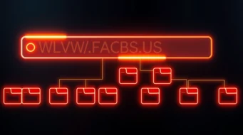
2) Navigation and Wayfinding (How Users and Crawlers Discover Meaning)
Navigation is UI’s most underrated SEO lever because it shapes discoverability. If users can’t find related pages, your internal links lose value. If crawlers can’t interpret the site’s logical structure, your topical architecture weakens.
High-performing navigation UI usually combines:
Clear menu taxonomy (no vague categories).
Contextual links inside content (the strongest intent match).
Breadcrumbs for hierarchy reinforcement via Breadcrumb Navigation.
Search UI that helps users self-route when menus fail.
This is where semantic architecture becomes practical. A site should behave like a topical system with a root and nodes, similar to how a Root Document acts as the main hub and a Node Document branches into subtopics.
Navigation UI impacts (direct + indirect):
Better internal discovery → higher engagement and deeper sessions.
Cleaner crawl pathways → fewer wasted crawls and better distribution of internal signals.
Stronger topical clarity → reinforces Topical Authority through structured coverage.
Practical UI navigation patterns to implement:
Use in-body links as “meaning-based pathways” (not random “related posts”).
Avoid link dumping; instead create intentional bridges that preserve Semantic Relevance between the current section and the next page.
Make navigation labels match how users think, not internal team jargon.
Keep internal linking consistent to avoid orphaned URLs, especially when content expands across clusters (this also prevents Orphan Page problems).
A transition rule that works: every UI navigation step should feel like a continuation of intent, not a forced redirect. That’s the same philosophy behind a semantic network and a well-built Topical Map.
3) Contextual UI Elements (Supplementary Content That Improves Outcomes)
Most sites treat supplementary UI like decoration, sidebars, accordions, “related posts,” sticky widgets. But when you understand meaning, supplementary UI becomes a ranking asset because it improves comprehension, internal movement, and satisfaction.
In your content system, supplementary UI should behave like Supplementary Content that supports, not distracts, from the main intent.
Examples of SEO-positive supplementary UI:
“Key takeaways” boxes (helps scanning + retention).
Glossary callouts for advanced terms (reduces cognitive load).
Expandable FAQs inside the page (helps deeper coverage without clutter).
“Next step” modules that act like contextual bridges into supporting pages.
This connects directly to Content Configuration, how you place elements like links, modules, and information blocks so the page becomes a guided journey, not a scroll trap.
Supplementary UI rules that prevent SEO damage:
Don’t use aggressive Interstitials that block content and break the journey.
Keep related modules tightly aligned to the current intent (semantic relevance > “popular posts”).
Avoid overwhelming the user with too many competing calls-to-action.
The goal is simple: UI should reduce uncertainty. And reducing uncertainty increases trust, one of the foundations behind systems like Knowledge-Based Trust.
Interactive Elements and Controls: Where UI Becomes Behavioral Data
Interactive controls are the UI points where users reveal intent, buttons, filters, tabs, accordions, search bars, form fields, and micro-interactions. If these controls are confusing or slow, users don’t “continue the journey,” they abandon it, making your internal pathways meaningless even if your content is strong.
A semantic SEO site is supposed to feel like a guided system of discovery, where each action strengthens topical movement like a Query Path inside a real search session. When UI blocks actions, it breaks that path before the user reaches deeper node pages.
Design your controls to reduce friction, not increase decisions
A high-performing UI interaction layer usually includes:
Clear micro-copy and visible states (selected / active / disabled)
Predictable patterns (buttons look clickable, links look like links)
Low latency feedback (users should never “wonder” if it worked)
Controls that preserve meaning (filters shouldn’t create accidental duplicate intent pages without a Canonical URL)
When your controls are consistent, you reduce confusion and strengthen the continuity of meaning, similar to keeping a page inside a Contextual Border while still letting the user move via a Contextual Bridge.
Transition idea: once controls work smoothly, the next UI layer is readability, because even perfect navigation fails if people can’t comfortably consume what they land on.
Typography and Content Presentation: UI That Converts Scrolling Into Understanding
Typography is not a “style decision”, it’s comprehension engineering. Font size, line-height, contrast, spacing, and heading structure decide whether users can scan, recognize priorities, and extract answers quickly.
Search engines don’t “read fonts,” but they observe outcomes, and typography directly influences Bounce Rate because unreadable content feels like “wrong result,” even when it’s correct.
The heading system is your semantic skeleton
Strong typography uses a consistent heading system that supports both human scanning and machine interpretation via HTML Heading. When headings are structured properly, each section becomes a clean information unit, aligned with the semantic principle of Structuring Answers.
UI typography rules that support SEO outcomes:
Use clear H2 → H3 patterns (don’t jump levels)
Open each section with the direct answer, then expand (structured-answer pattern)
Break long paragraphs into scannable chunks (reduce cognitive load)
Use bold and lists for meaning, not decoration (avoid “visual noise”)
If your typography makes the page “easy to finish,” you increase engagement depth and strengthen the behavioral feedback loop that click-driven ranking systems depend on, exactly what Click Models & User Behavior in Ranking describes at a system level.
Transition idea: once people can read comfortably, the next UX breaker is uncertainty, users need constant status feedback to stay confident and continue.
Feedback, States, and System Status: The UI Layer That Builds Trust
Users abandon pages when they feel uncertainty: “Did it submit?” “Did it load?” “Where am I?” “Why is this broken?” This is why UI feedback states (loading indicators, validation messages, success confirmations, error handling, empty states) are not optional, they are trust infrastructure.
In SEO terms, feedback states affect:
perceived quality and satisfaction (people continue instead of bouncing)
conversion completion (forms and checkout don’t fail silently)
trust signals that reinforce site credibility similar to Search Engine Trust and content confidence models like Knowledge-Based Trust.
The best feedback design prevents “pogo behavior” indirectly
Even without naming every behavior metric, the pattern is consistent:
unclear UI → more backtracking → shorter dwell thresholds → weaker satisfaction signals
clear UI → deeper task completion → stronger interaction trails
That’s why UI feedback loops should be designed as “meaning confirmations,” not just UI polish:
Form errors should tell the user exactly what to fix
Loading states should reassure (not freeze)
Empty states should guide next steps using relevant Internal Link pathways instead of dead ends
A practical way to keep feedback aligned to meaning is to treat UI messages as part of your content’s Contextual Flow, each message should move the user forward rather than stop them.
Transition idea: feedback and trust are incomplete without inclusion, because if any user can’t operate the interface, the “quality” is broken at the UI layer.
UI Accessibility and Inclusive Design: SEO-Friendly UI Must Be Usable for Everyone
Accessibility is UI quality at a higher standard. Keyboard navigation, focus states, readable contrast, proper labels, and semantic structure aren’t just compliance items, they expand real usability and reduce friction for a broad audience.
Accessibility also overlaps with technical clarity:
descriptive images should use Alt Tag so meaning isn’t locked behind visuals
structured headings via HTML Heading help screen readers interpret hierarchy
stable layouts reduce disorientation during interaction
Inclusive UI improves content reach and reduces hidden abandonment
When accessibility improves, the downstream SEO benefit is usually indirect but real:
more users successfully consume content (engagement rises)
more users can complete tasks (conversion paths stabilize)
fewer confusion exits that inflate Bounce Rate
At the semantic level, accessibility also supports clearer “content meaning signals” because structure is explicit and stable, similar to how a Contextual Hierarchy organizes meaning into layers that both humans and machines can follow.
Transition idea: once your UI is usable and understandable, performance becomes the final gate, because a perfect interface that loads slowly is still a failed experience.
UI Performance: The UI Decisions That Control Speed, Stability, and Interaction Quality
UI performance is where design choices collide with SEO engineering. Large hero media, heavy scripts, bloated CSS, and unoptimized fonts don’t just slow pages, they reduce interaction quality and make users abandon before the content gets a fair chance.
This is why UI performance sits inside Page Speed optimization and tool-driven diagnostics like Google PageSpeed Insights.
Mobile-first is the real UI test environment
Most UI failures happen on mobile:
touch targets too small
sticky overlays blocking content
heavy scripts delaying interaction
layout shifts causing mis-taps
Since indexing and evaluation heavily prioritize mobile presentation through Mobile First Indexing, your UI must be designed mobile-first not “responsive as an afterthought.”
UI performance best practices (SEO-aligned):
Compress and lazy-load non-critical media (don’t sacrifice the above-fold meaning)
Defer non-essential scripts (especially third-party widgets)
Use stable spacing to prevent layout jumps (visual stability = trust)
Reduce interaction latency (fast taps, fast state changes)
Keep content accessible quickly, especially the “direct answer” portion (supports structured answers)
If you treat your interface like a system that must deliver meaning fast, you align UI engineering with modern retrieval expectations, where satisfaction is shaped by speed, clarity, and interaction continuity, not just relevance.
Transition idea: now that UI is readable, trustworthy, inclusive, and fast, let’s connect how these UI outcomes translate into measurable SEO visibility.
UI’s Role in SEO and Search Visibility: UI as an Indirect Ranking System
UI isn’t a “direct ranking factor” in the simplistic sense, but it heavily influences the signals that ranking systems learn from, especially when user behavior becomes feedback for relevance models.
When your UI supports task completion, it improves:
deeper internal exploration (more meaningful pathways)
longer satisfaction windows like Dwell Time
higher interaction continuity across the site structure
Over time, that strengthens how your site performs in competitive SERPs, improving Search Visibility because users consistently “choose and stay” rather than “click and leave.”
UI also controls crawlable discovery through architecture
Good UI reinforces crawl logic when it reflects clear hierarchy:
A clean taxonomy system supports discoverability like a structured Taxonomy model
Intent-aligned internal links strengthen Topical Coverage and Topical Connections
Pages become purposeful nodes in a network through Node Document design connected to a central hub via Root Document
That’s how UI becomes “semantic infrastructure”, it visually enforces the same relationships you want search engines to understand through your topical graph.
Transition idea: if UI influences SEO through outcomes, then you need a reliable system to measure and test UI changes like an SEO experiment, not guess.
UI Best Practices for Modern Websites: A Semantic-First Checklist
Best practices are only useful when they connect to outcomes. So instead of “make it pretty,” the UI goal is: reduce friction, preserve meaning, and strengthen discovery.
Below is a practical checklist you can apply page-by-page, especially for pillar pages and cluster hubs.
UI clarity rules (meaning first, decoration second)
Prioritize comprehension over aesthetics (clarity beats complexity)
Keep the primary answer visible near The Fold while still supporting depth through structured sections
Use predictable controls and consistent patterns (avoid surprise behaviors)
Replace “random related posts” with contextual links that preserve Semantic Relevance
Prevent dead ends: every major section should offer a meaningful next step through an intent-aligned Internal Link
UI technical hygiene rules (speed + stability + crawl alignment)
Treat UI assets as SEO assets: optimize them like content
Keep URLs and variations clean using Canonical URL logic when UI generates parameterized states
Avoid thin doorway UI states (don’t generate low-value indexable pages accidentally)
Use Structured Data (Schema) where appropriate so UI content blocks map cleanly to meaning systems
These practices work best when they align with a real content system, one where each page stays within its Topical Borders while still offering intentional bridges to adjacent concepts.
Transition idea: best practices become scalable when you adopt a testing system, because UI changes without measurement often break SEO invisibly.
Measuring and Testing UI Changes With an SEO Mindset
UI changes can improve conversions while hurting SEO, or improve SEO while hurting conversions, unless you measure with the correct lens. The right approach is to treat UI as a system that changes behavior, and behavior feeds both conversion and ranking feedback loops.
A semantic-first UI testing system usually ties together:
behavior analytics (scroll depth, engagement, completions)
search impact (rankings, traffic, click-through changes)
crawl/index health (coverage changes, duplication risk)
intent satisfaction (do users complete their task?)
What to measure (and why it matters)
Engagement depth:
stronger UI structure improves meaningful consumption signals like Dwell Time
Internal movement:
users actually use your “content network” when UI supports discovery (node → node routing)
Conversion completion:
UI clarity supports Conversion Rate Optimization (CRO) and stabilizes Conversion Rate outcomes
Mobile usability:
performance and touch UX directly affects outcomes under Mobile First Indexing
At the system level, this connects to how ranking systems can interpret “satisfaction” from behavior, exactly the space described by Click Models & User Behavior in Ranking.
Transition idea: once you can measure UI impacts, you can also design for what’s coming next, AI-driven search experiences that reward clarity, structure, and fast meaning extraction.
Future Outlook: UI in an AI-Driven Search World
Search is increasingly shaped by systems that extract, summarize, and re-rank information based on usefulness, not just keywords. That pushes UI toward structured clarity: content that’s easy to interpret, easy to navigate, and easy to validate through supporting context.
In semantic terms, future-friendly UI aligns with:
content that stays inside strong contextual borders and uses intentional bridges
architecture that supports entity relationships like an Entity Graph
design patterns that make each section a clean answer block (structured answers)
You can see this “system thinking” reflected across semantic retrieval concepts like Information Retrieval (IR) and even query-level transformations such as Query Rewriting, because when queries get rewritten and refined, your UI must still help users complete the resulting intent cleanly.
Transition idea: to close the pillar properly, let’s answer the most common UI + SEO questions in a fast, structured way.
Frequently Asked Questions (FAQs)
Is UI a direct Google ranking factor?
UI is rarely a single “toggle” ranking factor, but it strongly impacts outcomes tied to ranking, especially satisfaction signals like Dwell Time and long-term Search Visibility.
What UI changes usually improve SEO the fastest?
The fastest wins are typically clarity + speed: better heading structure using HTML Heading, improved Page Speed, and better internal discovery via intent-aligned Internal Link pathways.
How does UI affect topical authority?
Topical authority grows when users can discover and consume your full coverage. UI supports that by making your Topical Coverage and Topical Connections usable, and by keeping each page scoped using Topical Borders.
Why does mobile UI matter more than desktop UI for SEO?
Because evaluation heavily prioritizes mobile presentation through Mobile First Indexing. If your mobile UI is slow or hard to use, content quality becomes irrelevant because users don’t reach the payoff.
What’s the simplest way to connect UI improvements to SEO testing?
Treat UI changes like controlled experiments and track both conversion impact and SEO impact together: Conversion Rate Optimization (CRO) metrics, behavioral signals like Bounce Rate, and search-level outcomes like Search Visibility.
What is a user interface (UI)?
A user interface is the visual, interactive, and behavioral layer through which people execute their intent on a website or app, including layouts, buttons, menus, typography, forms, icons, and feedback states. In SEO terms, UI is not decoration but the delivery mechanism for content. It determines whether your content is consumed, your internal links are used, and your architecture becomes a usable network.
What is the difference between UI and UX?
UI and UX are layers of the same system rather than competitors: UX is the journey logic and satisfaction outcome, while UI is the surface execution through controls, visual hierarchy, and interaction patterns. UX is the why, and UI is the how. A strong UX strategy still fails if the UI introduces friction in scanning, navigation, or forms.
What UI components most influence SEO outcomes?
The components that matter most are layout and visual hierarchy, navigation and wayfinding, contextual supplementary elements, interactive controls, typography, feedback states, and accessibility. Each reduces friction while strengthening clarity, discovery, and task completion. Design choices in these areas quietly become ranking outcomes through engagement and satisfaction.
How does navigation UI affect discoverability?
Navigation UI shapes discoverability for both users and crawlers, so weak navigation means internal links lose value and crawlers struggle to read the site’s structure. Strong navigation combines clear menu taxonomy, contextual in-content links, breadcrumbs, and search UI. Better internal discovery leads to deeper sessions, cleaner crawl pathways, and stronger topical clarity.
How do UI feedback states build trust?
Feedback states such as loading indicators, validation messages, success confirmations, and error handling reduce the uncertainty that makes users abandon a page. They affect perceived quality, conversion completion, and credibility signals. Clear feedback, like form errors that explain exactly what to fix, moves users forward instead of pushing them back to the SERP.
Why does typography matter for UI and SEO?
Typography is comprehension engineering, because font size, line height, contrast, spacing, and heading structure decide whether users can scan and extract answers quickly. Search engines do not read fonts, but unreadable content feels like a wrong result and can raise bounce rate even when the content is correct. A consistent heading system also supports both human scanning and machine interpretation.
Last Thoughts on UI
Key Takeaways
- A user interface is the interactive layer that delivers content, so it controls whether content is consumed and internal links are used.
- UI and UX are paired layers: UX is the journey and satisfaction logic, UI is the surface execution that can make or break it.
- Key UI components include hierarchy, navigation, supplementary elements, controls, typography, feedback states, and accessibility.
- Navigation UI drives discoverability for users and crawlers, improving session depth, crawl pathways, and topical clarity.
- Feedback states reduce uncertainty and build trust, helping users complete tasks instead of backtracking to the SERP.
- Typography is comprehension engineering, since readable structure lowers bounce rate and supports both scanning and machine interpretation.
Great UI doesn’t just make pages look better, it makes intent easier to complete. And as search engines rely more on meaning systems (entities, structured answers, and behavioral feedback), UI becomes the layer that decides whether your content network behaves like a real semantic system or a disconnected archive.
If your UI supports clear hierarchy, accessible structure, fast delivery, and contextual movement, it becomes compatible with how modern search interprets journeys, especially when queries evolve through systems like Query Rewriting and user behavior is modeled through frameworks like Click Models & User Behavior in Ranking.
Want to Go Deeper into SEO?
Explore more from my SEO knowledge base:
▪️ SEO & Content Marketing Hub — Learn how content builds authority and visibility
▪️ Search Engine Semantics Hub — A resource on entities, meaning, and search intent
▪️ Join My SEO Academy — Step-by-step guidance for beginners to advanced learners
Whether you’re learning, growing, or scaling, you’ll find everything you need to build real SEO skills.
Feeling stuck with your SEO strategy?
If you’re unclear on next steps, I’m offering a free one-on-one audit session to help and let’s get you moving forward.
Table of Contents
Toggle